CPR - Center for Performance Research
Brand Identity
Web Development
Repurpose and Reframe
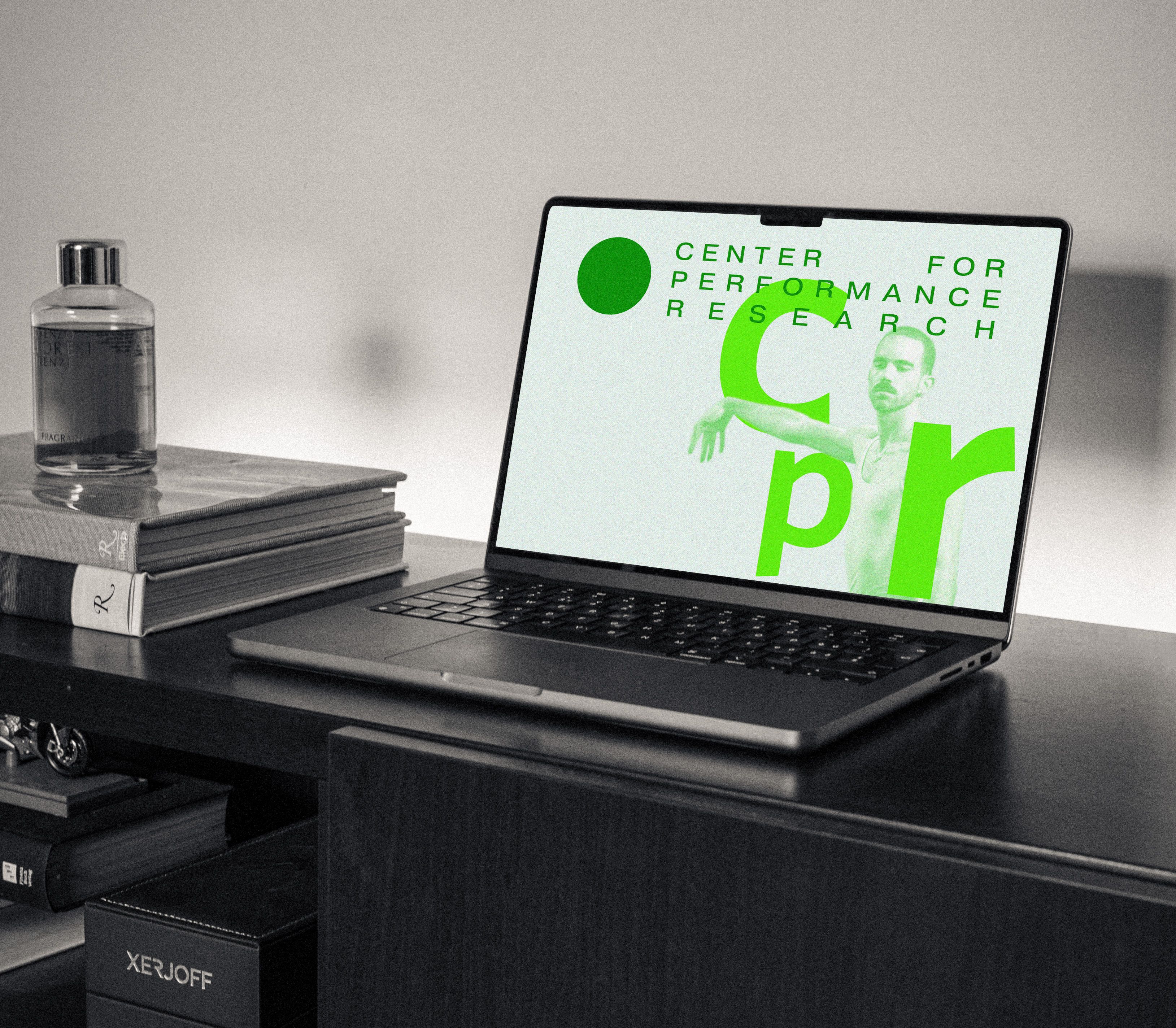
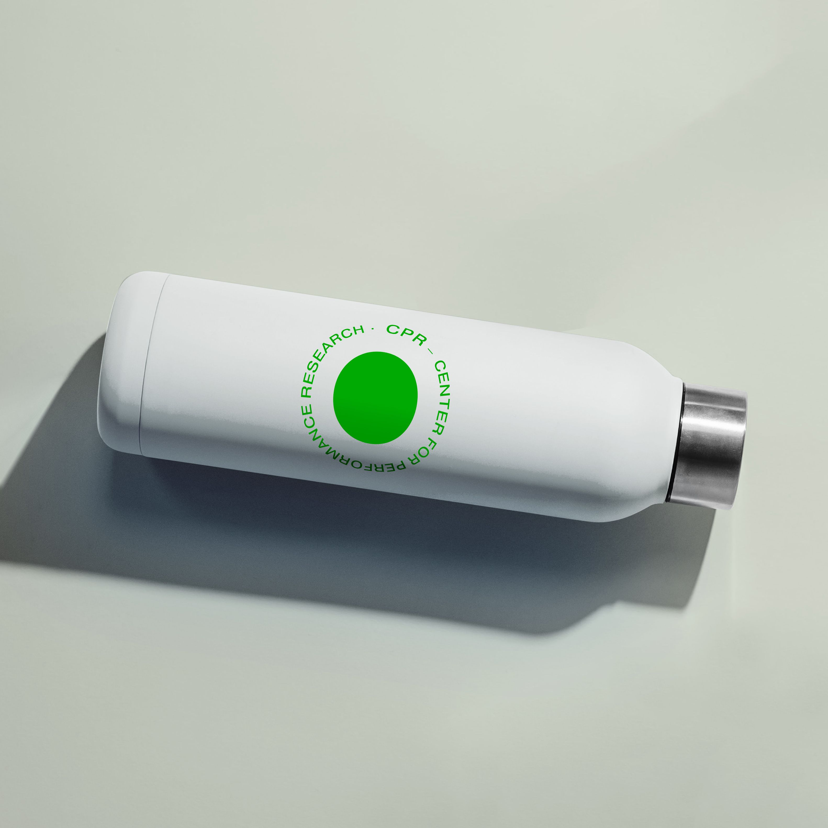
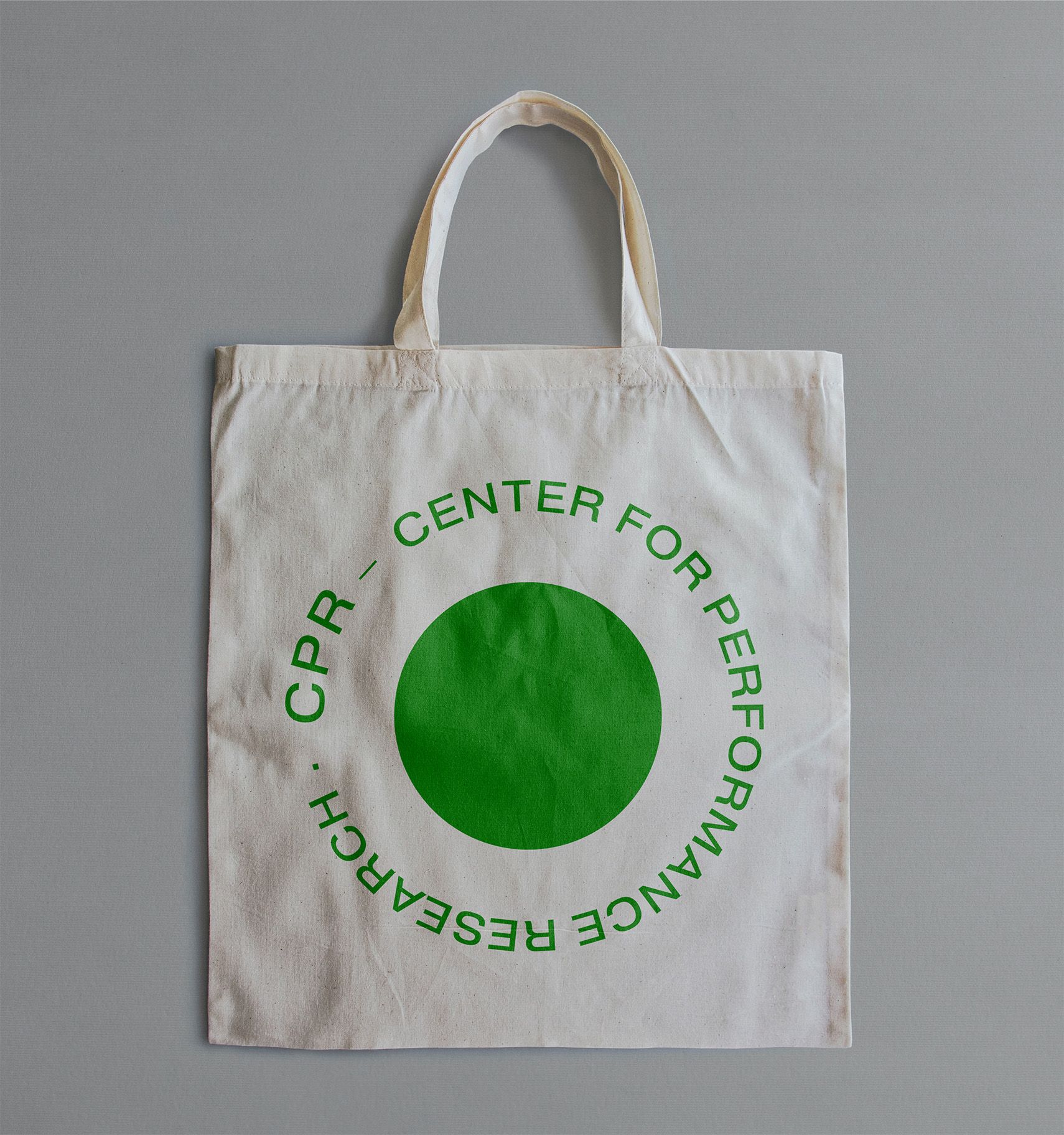
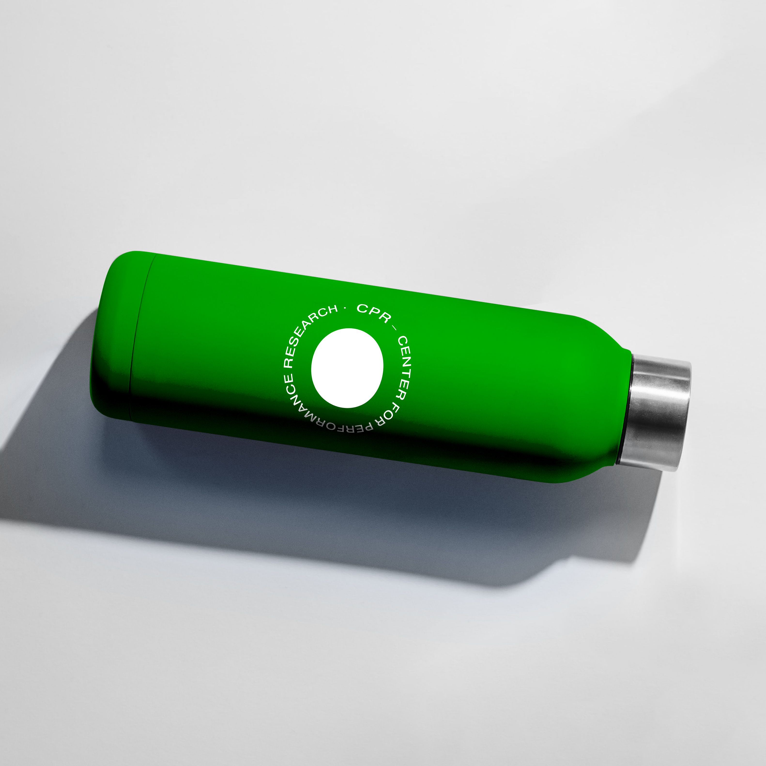
We took the classic CPR green and repurposed the rich hue with a minimal, modern, and bold new logo. We played with the circles in their filled, solid state to honor their existing community and history as well as circles with a porous perimeter to invoke invitation and change. The logo easily adapts itself across various surface and materials used in branding merchandise and building signage while lending the same flexibility in marketing CPR's various artist programs.
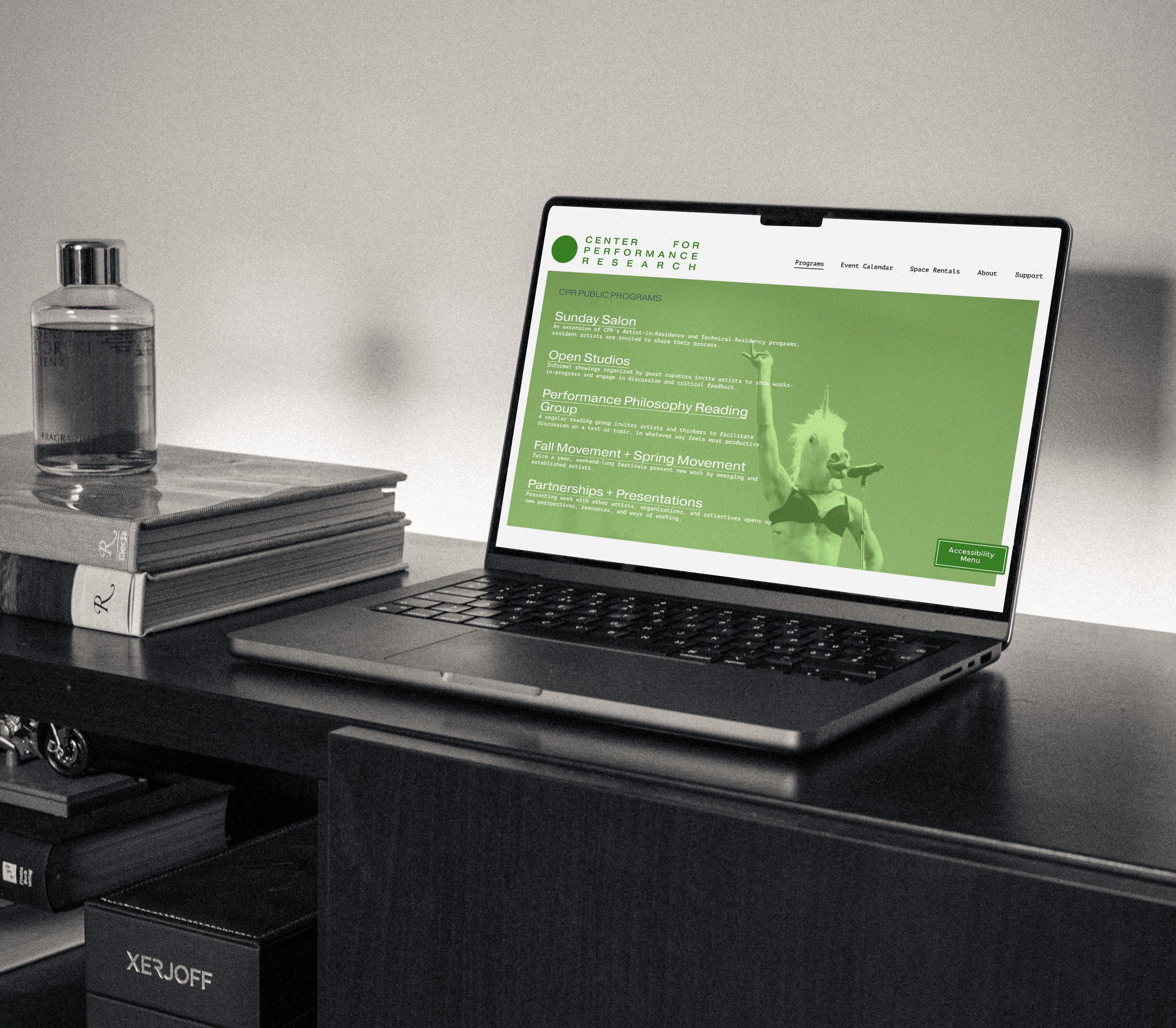
On the website, we extended this playful deviation with complimentary shades of green and layered images while prioritizing access to key information, legibility, and clear direction.


In an effort to build a low-carbon, more eco-friendly website, we have chosen to reduce the amount of images stored on this site. For images from our workshops and events, please visit our Instagram.
Design by FAILSPACE Design Services.